‘Holding a rainbow in your hand’ – that is a fitting description the incredible experience of owning an opal. Have you ever wondered how all these colours form within those little beauties? We know that White opal is white because of magnesium oxide and Black opal is grey-to-black because of the presence of Iron Oxide. But what about the rainbows within opals? Why do some opals display a broad variety of colours while others only show blue or green colours? And why are some opals so much brighter than others? In order to answer these questions, let’s start with a short re-cap of how opals are formed.
The history of the formation of Australian opals started thousands of years ago when Australia was covered by a large inland sea (the Great Artesian Basin). The sea covered almost 60 per cent of the land area from Coober Pedy in South Australia up to the Guld of Carpentaria in the North. When the sea started to dry out the acidity level in the shallow ground was altered and massive amounts of organic material (plant and bone) were buried in the silica (sand).
Silica is the first building brick for the creation of opals. The second step of opal formation involves the second major building brick for opals comes into play: water. As rainwater ran through the ground it picked up the silica from the sandstone and carried this silica-rich solution into natural cracks and crevices which were formed cavities left by dinosaur or plant fossils.
Within these cracks and crevices, this solution of hydrated silica gel (silica bonding with water) remained as a deposit. As this deposit hardened, opal and sometimes precious opal are formed. The process on exactly what causes the silica to bond with water and form new molecules is still a scientific mystery!
There is, however, an important aspect during the process of hydrated silica layering up in the crevices: the precise, perfect way in which the molecules lay themselves in a sequential order. Think of the molecules as marbles that are put into a container. There are basically two ways in which you can put them in: you either put them in order, one-by-one in perfectly straight alignment. Or you simply throw them into the container, and they land chaotically (unordered) on the inside. These two possibilities graphically explain the reason why there is precious opal and non-precious opal (Opal potch). Precious opal will only be found if the molecules (our marbles) are ordered in perfectly straight lines. If the silica molecules form unordered, Opal without colour forms. We call this potch.
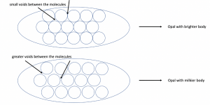
The molecules form in sizes from 150 to 400 nanometres – these sizes determine the colours that are formed. The first scientist to identify this order was J.V. Sanders in 1964. Sanders conducted research on the colour of opals and under a microscope. He basically found out, that voids between the molecules play a major role: The more irregular the voids between the molecules are, the milkier the opal appears.
So far, so good. We know now how opal is formed and what the difference between potch and precious opal on a molecular level is.
The next question we need to answer is, why the rainbow colours in the opals are so bright. Colours form in many gemstones, red in ruby, green in emerald, blue in sapphire yet none have the ‘fire’ vibrance and intensity that Australian Opals display. In order to understand this we have to take a look at optics: First we need to understand what light and perceived colour actually are. Light is the visible part of electromagnetic radiation – radiation waves of different length are perceived by our eyes as different colours. Therefore, are colours those specific kinds of waves every object in the world radiates. What is crucial to know is, that white light consists of all spectral colours. If you look at the prism in the image below you can see how white light is diffracted into all the colours of the rainbow.
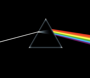
When white light is being diffracted, it depends on the angle of the diffraction which colours are eventually to be seen. Red has the longest wavelength and violet the shortest – the remaining colours of the rainbow, orange, yellow, green, blue and indigo are to be found in between.
Opals forms complex molecular structures that are far more complex than a simple prism, structures that function in a far more complex way. When light hits the spheres of the hydrated silica molecules, it is diffracted, forming complex rainbows. The reason for the different colours lies in the sizes of the molecules and the wavelength of the light. The smaller the molecules are, the smaller is their diffraction angle and therefore the smaller is the wavelength of the light which is emitted. The larger the molecules are, the longer is the emitted wavelength of the light. Therefore, do the largest molecules emit red light and the smallest violet/blue light.
However, as larger silica molecules take a longer time to form there are less gemstones with larger ones – translated into real life context: less large molecules being able to display red colour light meaning less opals showing a red tone. Therefore, these opals are more valuable than those displaying a blue-ish colour.

The reasons why Opal is so unusually bright are:
- The contrast of colour
- Lustre due to surface structure and absorption
- Perception
Contrast of Colour: The effect of contrast of colour is an explanation why the rainbow colours in Black Opals are brighter than those in White Opals. The key is the body tone of the opals. Opal body tones are determined by the presence of iron oxide and magnesium oxide (in white Opal).
Now let’s go back in time. Remember when your teachers would write or draw on the blackboard. Those blackboards have a dark background which lets us perceive colours brighter than if they were drawn on a white sheet of paper. This contrast is called colour aberration.
This effect can be seen in Black Opals: the black backing of the body tone allows the rainbow colours to appear to shimmer brighter. This is the reason why Doublets and Triplets are so popular. A backing of black potch is used in order to create a contrast that makes the opal even brighter.
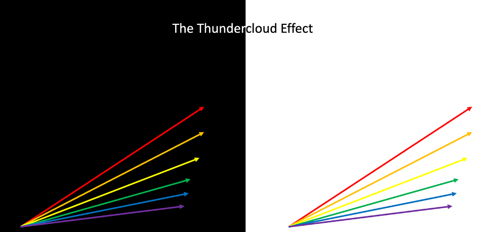
We call this the thundercloud effect a similar, as seen when a black thundercloud moves behind a rainbow, the black base tone makes the rainbow appear to be far brighter, when we are actually seeing the same rainbow colours!
Lustre also increases the appearance of the colours. Colour lustre is due to surface structure and absorption: At the beginning of this explanation, we learned how common opal and precious opal can be distinguished – by the ordering (or lack of ordering) of the molecules. That specific perfectly aligned order of the molecules also plays an important role increasing the lustre.
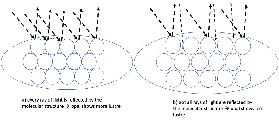
The more perfectly the molecules are aligned (ordered) the brighter the gemstone appears. Why is that? Here, again, the diffraction of light is the key. On a molecular basis, the closer and the more regular molecules are ordered, the more light is diffracted and reflected into the same direction. You can understand this concept, if you think of the molecules as tiny mirrors reflecting light: if you have many mirrors positioned in different directions and of different sizes, they will reflect light in many directions. But if they are positioned in such a way that they reflect the light in the same direction, much more light will be caught by your eyes. An Opal is like millions of microscopic mirrors reflecting and refracting the light multiplying the effect.
Absorption also plays a role. Objects (like windows) made of glass are transparent and do therefore not absorb light (the light is not reflected, and glass has almost no lustre). In most opals that is not the case: their structure allows for absorption of light which is then diffracted and reflected. This is like glass that creates its own internal colour play generating and forming an inner glow!
Perception: The last aspect that the way our human eyes perceive colours – the Illusion of Luminosity (figure 6). The photograph contains a transparency created by superposing several different lengths of gelatine film – in order to form a series of steps. At the right end of the photograph, the light has passed a single layer of film.
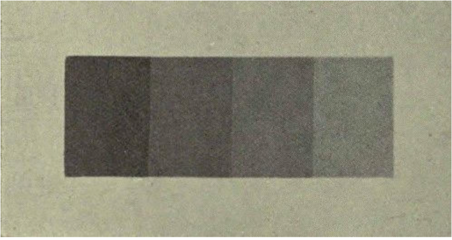
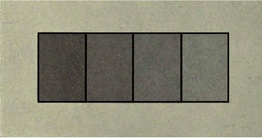
With each step towards the left-hand side, the light has passed one step more than before. Thus, the light had to pass through four layers of film at the left-hand end. Interestingly, we perceive the steps as of continuously decreasing or increasing luminosity. So, the left ends of the small boxes will appear darker than the right hand side. This illusion, however, vanishes when the boxes are separated from each other by lines (figure 7). The same illusion occurs when we see a colour gradient in an Opal – our brain will automatically perceive these colours in the same way as in figure 6.
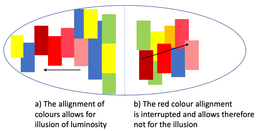
In figure 8 this illusion is schematically presented with the colours of an opal. While on the left-hand side the red colour tones are aligned, on the right-hand side the alignment is somewhat interrupted by other colours. Therefore, structures like in a) allow for such an illusion and structures like in b) would not show such illusions.
This shows us, however, that not every opal’s colours are pushed by such an illusion. As each opal is absolutely unique, there is no guarantee for all the illusions mentioned in this article, to take place in each opal equally.
Another aspect we need to consider is, how we perceive the intensity of colours. This is called the fluctuation of unaided judgement and affects our perception of the purity of colour.
The rule, basically, is that when any colour is foremost (predominant) in our field of vision, we tend to perceive it as ‘less pure’ or ‘paler’. In contrast to that, if there are two or more colours dominating, our eyes perceive will perceive the colours as ‘stronger’. Figure 9 might at first glance appear complicated – but it helps us understand the ‘purity’ of the perceived colours.
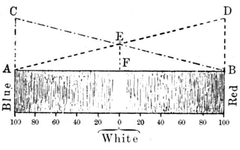
Let’s think of one specific colour – in case of figure 9 it is red. A red which is completely pure, is absolutely free of any admixture of white. The diagram shows (starting at the right-hand side) a pure red-tone which is continuously diminished by white and is then turned into greenish-blue on the complementary side of the spectrum (towards the left). As it contains more and more white, the paler it will get until it will have lost all its red and is indistinguishable from white.
But as we learned before – white light is mixture of all colours. Therefore, in ‘pure’ white, the share of red can never be 0%. In our diagram here, the white in the middle consists to a common share of 50% red and 50% blue. This is perfectly described by the triangles and quadrilaterals in the diagram: quadrilateral EDBF shows the amount of red – from 100% to 50% in the white area. Triangle EBF shows the share of blue in the tone – from 0% to 50% in the white area. So that is basically the physical appearance of the paleness of the colours.
But what happens in – so to speak – real life, is that we unconsciously dislocate the 0 in the middle when we see a single colour.
As we already explained at the beginning – we perceive this colour as paler than it actually is.
Why is that important for the perception of colours in opals? It is because when many different colours work together (in contrast) we perceive them stronger.
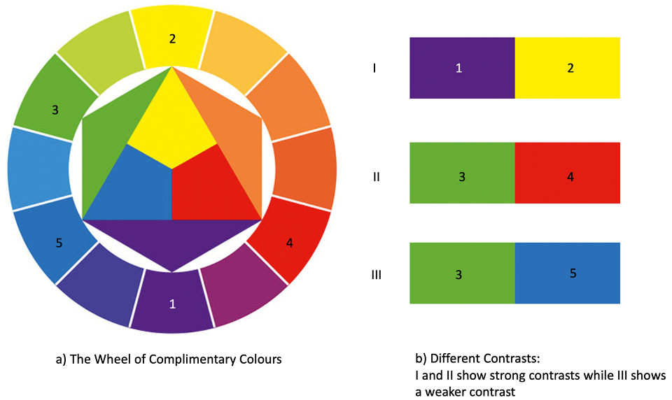
That is also because of the complementary colour system. In the colour wheel, each colour has a complementary colour. So, for blue the complementary colour would be yellow. Whenever complementary colours appear next to each other, due to the great contrast, we will perceive these colours as brighter than if they were no complementary colours.
__________________________________________________________________________________________________________________________________
Let’s wrap it up! We learned that there a physical and ‘psychological’ reasons for the circumstance that some opals appear brighter than others:
- The more ordered the molecular structure of the opals the more light they reflect.
- The smaller the voids between the molecules, the less milkier our opal appears.
- Colour contrast on dark backgrounds strengthens the colours’ effect.
- The illusion of luminosity makes us perceive some colours brighter.
- Complementary colours enhance the effects of colour brightness.
This is simply the worlds most beautiful gemstone, rich, complex colour combinations with a number of mindboggling unique scientific mysteries all working together to give us a gemstone that literally looks like it has an internal fire. Brilliant, beautiful and exceptional Opal is a wonderful and mysterious and exceptional!